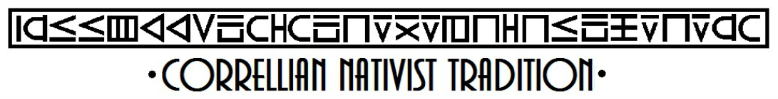
THE CORRELLIAN ALPHABET
The Correllian alphabet was designed in the mid ‘70s, at the request of the Blv. Regent LaVeda. It was intended to serve both as a code, for the writing of secret records, and to be used for decorative purposes. Of course it can also be used for writing sacred and magical documents, serving to help focus the writers attention and energies.
The Correllian alphabet will be seen to be extremely rectilinear and heavily square. It will be remembered that Four is the number of physical manifestation, and thus the square is the shape of manifestation as well as practicality –and practicality is one of the cornerstones of Correllian ideology.
The Correllian alphabet is meant to be written in vertical rows, as shown below, rather than horizontal rows. The alphabet can be written horizontally as well –however over the 25 odd years of its use the methods for using it horizontally have varied. The current recommendation for using the alphabet horizontally is to turn the letters on their sides, so that in effect you have a vertical row that has just been turned sideways. The reason that vertical columns were chosen when the alphabet was designed was to facilitate its use in the Correllian state robes –which at that time featured a central CLAVIS, or vertical stripe. However the alphabet is only rarely used in the state robes today.
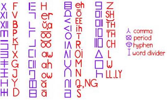
The alphabet features forty letters, which include a variety of vowels and dipthongs which are represented differently than in English. This is to be born in mind when translating to or from this alphabet: words are spelled more or less phonetically with the Correllian alphabet. However there have never been any hard-and-fast rules and certain inscriptions which you may see in older Correllian regalia or artwork sometimes simply use the common English spelling of words.
To make the alphabet more legible, word dividers are used between each word so that the letters do not run together. Usually the word divider resembles the English letter I, but again there has been variation over the years, and occasionally you may see older Correllian inscriptions where the words are divided by simple dots.
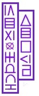
Left: Here is the name of the Retired First Priest, Rev. Don Lewis, written in the Correllian alphabet. In this case the name is written vertically as the alphabet was originally intended to be used.